I am currently sitting here with my second iced coffee of the day, looking out the window, and trying to process the fact that we are deep into the biggest western fashion revival of our lives. Honestly, I am totally here for it. But there is one specific trend that keeps popping up on my feed, and we really need to sit down and have a serious chat about it today. We are talking about cow print.
I know, I know. Just hearing the words “cow print” might make you instantly think of a cheesy Halloween costume or a child’s farm-themed birthday party. It is a wildly intimidating pattern. It is loud, it is literal, and it is incredibly easy to get wrong. But when it is done right? Oh my gosh. It looks so insanely wealthy, chic, and elevated. It gives this effortless “I just threw this on but I also own a luxury ranch” kind of energy.
I have spent the last few weeks analyzing why some girls look like literal street-style models wearing it, while others look like they got lost on their way to a rodeo. It comes down to a few very specific rules. If you follow these, you can absolutely master this trend. So let’s break down exactly when cow print looks expensive, and when you should probably just leave it on the rack.
—
Rule 1: The Texture Test (Polyester is the Enemy)
If you take absolutely nothing else away from this post, please let it be this one rule. The reason cow print usually looks cheap is because of the fabric it is printed on. You cannot buy cow print on shiny, stretchy polyester or spandex. It just doesn’t work.
Think about it. A real animal hide has texture. It has weight and dimension. When fast-fashion brands take a flat photo of a cow spot and print it onto a flimsy, shiny piece of synthetic fabric, the illusion is completely broken. It looks flat and cartoonish.
I learned this lesson the hard way a couple of years ago. I was invited to this themed party downtown and I decided I was going to be the coolest girl there. I ordered this matching cow print mini skirt and crop top set online for like twenty bucks. When it arrived, I thought it looked okay in my dimly lit bedroom. But then I went to the party. Someone took a photo with the flash on, and the fabric literally reflected the light like a plastic trash bag. The spots stretched out weirdly over my hips and it just looked so painfully cheap. I deleted the photos immediately.
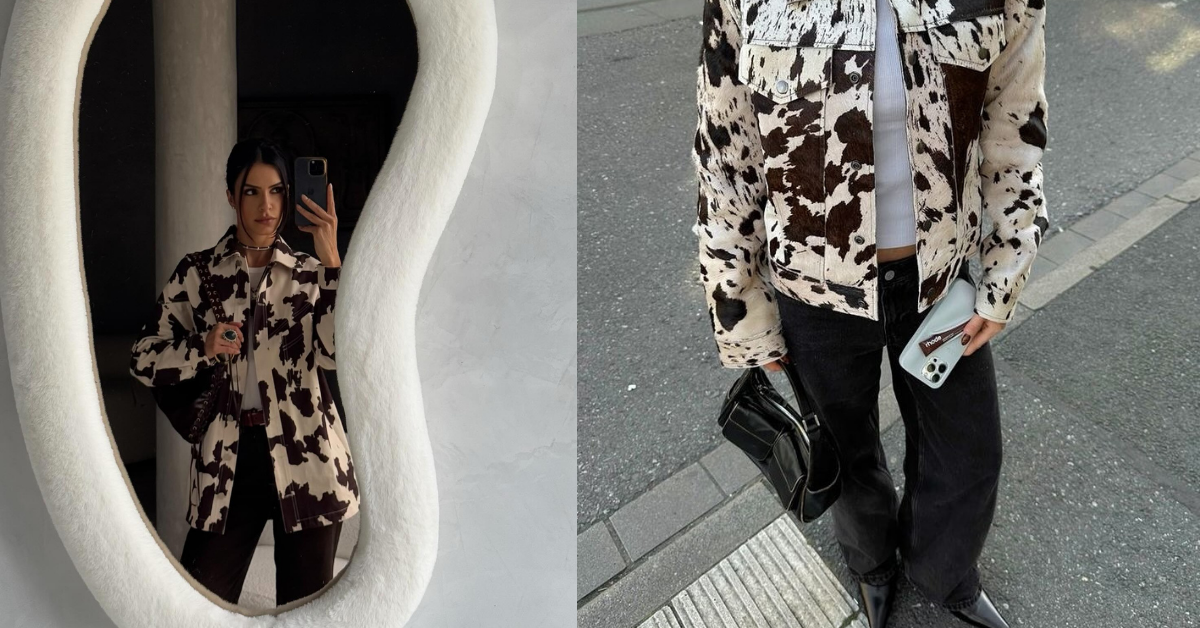
If you want cow print to look expensive, you have to invest in texture. You want genuine calf hair leather, or a really high-quality faux calf hair. If you are buying clothes instead of accessories, look for heavy, structured fabrics like a thick denim or a weighty canvas. The material needs to have some actual substance to it to carry such a bold print.
—
Rule 2: Brown and Cream > Black and White
This is a subtle styling trick, but it makes a massive difference. When most people think of cow print, they picture stark white with harsh black spots. Like a literal dairy cow. And while that can sometimes look cool in a very edgy, avant-garde way, it is usually really hard to style for everyday life. The contrast is just too severe.
If you want to look expensive, you need to look for brown and cream cow print. Think rich chocolate browns, warm caramels, and soft ivory tones. These colors automatically look more natural and sophisticated. They blend beautifully with the neutral basics you probably already have in your closet.
My Auntie back on the rez has this incredible vintage calf-hair belt. It is this beautiful warm caramel color with soft, irregular darker brown spots. She wears it over long, flowy linen dresses or with her favorite vintage Levi’s. It never looks like a costume. It just looks like a beautiful, earthy texture that adds depth to her outfit. Earth tones will always look more luxurious than harsh, optical-illusion black and white.
—
Rule 3: The Scale of the Spots
This is something I didn’t even realize until I started really studying runway photos. The size and shape of the spots actually matter so much.
You want to look for prints where the spots are large, organic, and irregularly shaped. They should look random. If the spots are too small and perfectly round, it stops looking like a cow and starts looking like a Dalmatian dog. And unless you are trying to channel Cruella de Vil – which is a vibe, but maybe not for a Tuesday morning coffee run – you want to avoid that.
When the spots are larger and spaced out nicely, the print reads as an abstract shape from a distance. It doesn’t scream “animal print” right in your face. It just looks like a really cool, abstract design. So next time you are shopping, take a step back and look at the item from a few feet away. If it looks like a hundred tiny polka dots, put it back. If it looks like large, flowing shapes, you have a winner.
—
Rule 4: The 10% Rule (Keep it in the Accessories)
Okay, let’s talk about how to actually wear it. Cow print is what I like to call a “hero” print. It demands all the attention. Because of that, you really shouldn’t wear it all over your body. A full cow print dress or a matching pants-and-jacket set is almost impossible to pull off without looking like you are wearing a disguise.
The secret to making it look incredibly wealthy is the 10% rule. You want the cow print to make up only about ten percent of your total outfit. Accessories are your best friend here. This is the absolute safest and most chic way to wear the trend.
Imagine this outfit: You are wearing your favorite straight-leg blue jeans. You have on a crisp, oversized white button-down shirt, partially tucked in. You throw on a classic beige trench coat. And then, you step into a pair of calf-hair cow print mules or ankle boots. Suddenly, that basic, everyday outfit is elevated to a completely different level. The pop of pattern shows that you understand fashion, but the fact that it is just on your shoes shows that you don’t have to try too hard.
Bags are another amazing way to do this. I found this gorgeous, structured little shoulder bag at a thrift shop last month. It has a plain black leather back and a brown cow print front flap. I have been wearing it with simple monochrome outfits – like all black or all cream – and I get stopped on the street constantly. It acts as the centerpiece of the outfit without overwhelming my frame.
—
Rule 5: Ground it with Classic Staples
When you are wearing a loud print, you have to anchor it with really solid, classic basics. You cannot mix cow print with other crazy trends.
If you are wearing a cow print belt, do not pair it with a neon pink shirt. Do not wear it with metallic pants. Do not mix it with leopard print or zebra stripes. You will look chaotic. You have to let the print be the loudest voice in the room.
The best colors to pair with cow print are rich, understated solids. Black, white, cream, navy, burgundy, and olive green are perfect. The contrast between a sophisticated, mature color palette and a fun, slightly wild animal print is what creates that high-fashion tension.
A few weeks ago, my best friend was stressing out about what to wear to a nice dinner downtown. She had bought this stunning cow print denim jacket but felt too self-conscious to actually wear it out of the house. I went over to her place and we dug through her closet. We ended up styling the jacket over a sleek, black silk slip dress with simple black strappy sandals and some gold hoop earrings. By keeping the rest of the outfit incredibly sleek and minimal, the jacket looked like a designer statement piece rather than a novelty item. She looked absolutely breathtaking and felt so confident all night.
—
What About Cow Print Pants?
I know some of you are probably wondering about cow print pants, because they are all over social media right now. Honestly? They are a massive risk. I am not saying it is impossible, but it is playing fashion on hard mode.
If you are dead set on wearing cow print pants, you have to follow all the rules we just talked about times ten. They need to be a heavy denim or leather. They cannot be tight – look for a relaxed, straight-leg or wide-leg fit. And you must pair them with the most boring, basic top you own. A simple black cashmere turtleneck or a plain white ribbed tank top. Let the pants do all the talking.
But personally? I think pants are just a lot of surface area for such a loud print. It can widen your lower half and draw the eye in a chaotic way. I always prefer to keep the print on my accessories or a jacket where I can easily take it off if I feel overwhelmed.
—
The Confidence Factor
At the end of the day, any trend really just comes down to how you carry yourself. Cow print is inherently a little bit playful and a little bit ironic. You can’t take yourself too seriously when you are wearing it.
If you put on a pair of printed boots and you spend the whole day looking down at your feet, wondering if people are staring at you, you are going to look uncomfortable. The clothes wear you, instead of you wearing the clothes. But if you throw on that print, keep your head up, and walk with purpose, people are just going to assume you know something about fashion that they don’t.
That is the real secret of the “expensive” look. It isn’t just about the price tag of the fabric, though that helps. It is about the attitude. Wealthy styling is usually relaxed styling. It is about looking unbothered.
Just a little note - some of the links on here may be affiliate links, which means I might earn a small commission if you decide to shop through them (at no extra cost to you!). I only post content which I'm truly enthusiastic about and would suggest to others.
And as you know, I seriously love seeing your takes on the looks and ideas on here - that means the world to me! If you recreate something, please share it here in the comments or feel free to send me a pic. I'm always excited to meet y'all! ✨🤍
Xoxo Clara